Helping people plan for buying a home
Fintech · Financial planning · Pre-regulation
Designing a mortgage planning experience that allowed customers to add a home-buying goal to their financial plan, understand the scale of the commitment, and see how it affected their long-term financial projection, without receiving financial advice.
This was less about precision and more about orientation.
My role
Principal / Senior Product Designer
The brief
Octopus Money was building Propeller, a financial planning platform designed to help people understand how major life decisions shaped their future wealth. Onboarding data consistently showed that buying a home was one of the most common goals.
The business needed customers to be able to add a mortgage goal themselves, enabling them to see how it affected their long-term forecast, and do all of it without relying on a financial coach. The initial brief was framed as a feature gap: "we need a mortgage calculator."

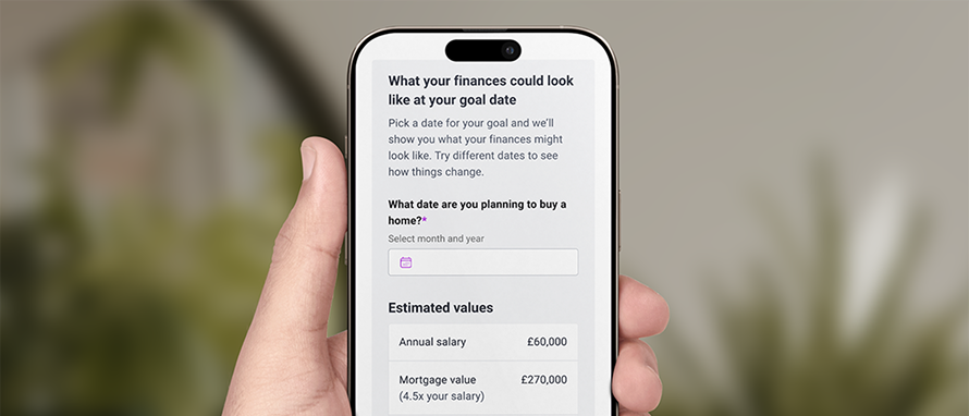
The Forecast page in Propeller visualises customers' wealth trajectory over time, integrating their financial goals to provide a holistic view of financial progress.
Early concepts tried to capture everything: property price, deposit structure, interest rates, taxes, fees. The result of this was a dense and intimidating experience. We discovered that the problem wasn't missing functionality, it was the cognitive load.
Users were being asked to make sense of a high-stakes, emotionally charged decision with low confidence and limited financial knowledge, while we were constrained by regulation from offering any advice. The experience needed to guide without directing.
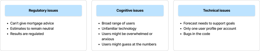
A range of potential issues and considerations were identified for the mortgage experience, categorised into three key groups: regulatory, cognitive, and technical.
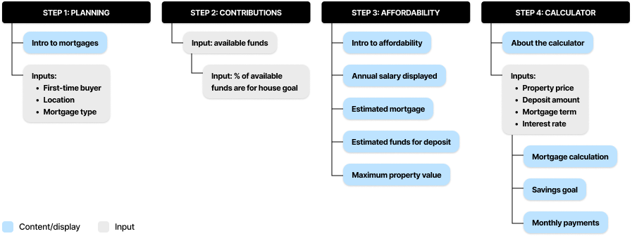
The information architecture of the mortgage flow, restructured into smaller, more digestible sections to reduce cognitive load.
What I did
As the first design hire, I led the experience end to end, and worked with Product, Engineering, and Compliance to reframe the problem before attempting to solve it.
The reframe was simple: instead of asking how to include every cost, we asked how to help someone think about a huge financial commitment without overwhelming them. We stopped trying to build a calculator and started designing a journey that separated planning from outcomes, layered complexity progressively, and used language precise enough to stay compliant without making people feel like they were reading a terms and conditions page.
Every decision was made with cognitive load in mind. We asked ourselves "what's the minimum someone needs to understand to move forward with confidence"?

Mobile wireframes exploring the UI layout, featuring large tappable buttons, meaningfully grouped inputs, and generous white space between sections to create a visually comfortable experience with minimal cognitive load.
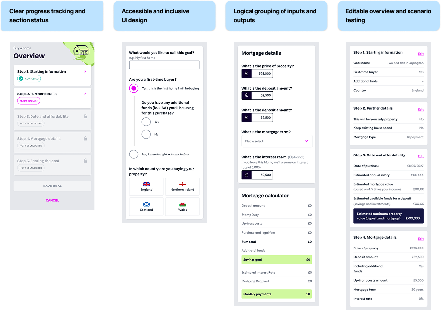
Medium-fidelity designs exploring accessible approaches to displaying the calculators, building on earlier concepts to further refine the experience.
What shipped
A self-serve mortgage planning experience that let customers add a home-buying goal and immediately see its long-term impact on their financial plan. The flow focused on the assumptions that actually mattered, avoided unnecessary detail, and sat cleanly inside the broader planning journey.
It was an MVP, but it worked. Users could manage their goals without needing a coaching session to get started. Analytics flagged friction points around terminology and explanation density, which informed later simplifications.
The bigger takeaway: in complex financial products, clarity creates confidence. Users don't need perfect calculations, they just need enough understanding to take the next step.
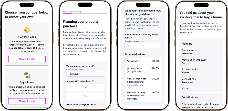
High-fidelity designs realised using the SaaS design system, bringing the concepts to life with production-ready visual detail.
What I'd do differently
Designing without user testing sharpened my instincts, but it also meant learning things in production that I'd have preferred to learn earlier. Validating language and mental models upfront would have saved a few iterations down the line.
What held the work together was agreeing on principles early. When technical or constraints pushed back, those principles kept us grounded in what actually mattered: helping someone make sense of something genuinely difficult.
My main take-away was that if something doesn't make sense, to keep asking questions. In complex financial systems, clarity rarely comes from adding more explanation.