Surfacing value earlier in the onboarding journey
Fintech · Financial planning · B2B SaaS · Research-led design
Redesigning the onboarding experience to deliver a personalised financial snapshot at the end of the flow, closing the gap between user effort and meaningful reward. The feature is now partially live and rolling out across the platform.
>60%
My role
Leading Product Designer
Analytics
Results from two weeks after launch
Completion rate
<10%
Return visits
280
Unique visits
0
Time to first value: reduced from ~2 weeks to zero
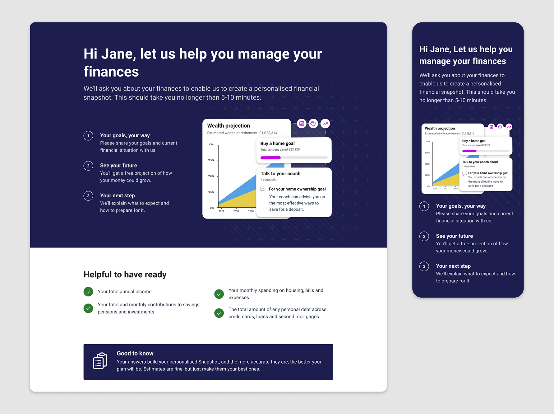
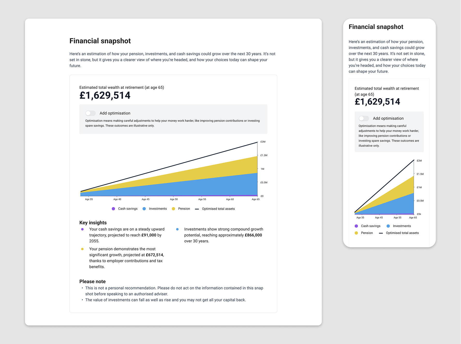
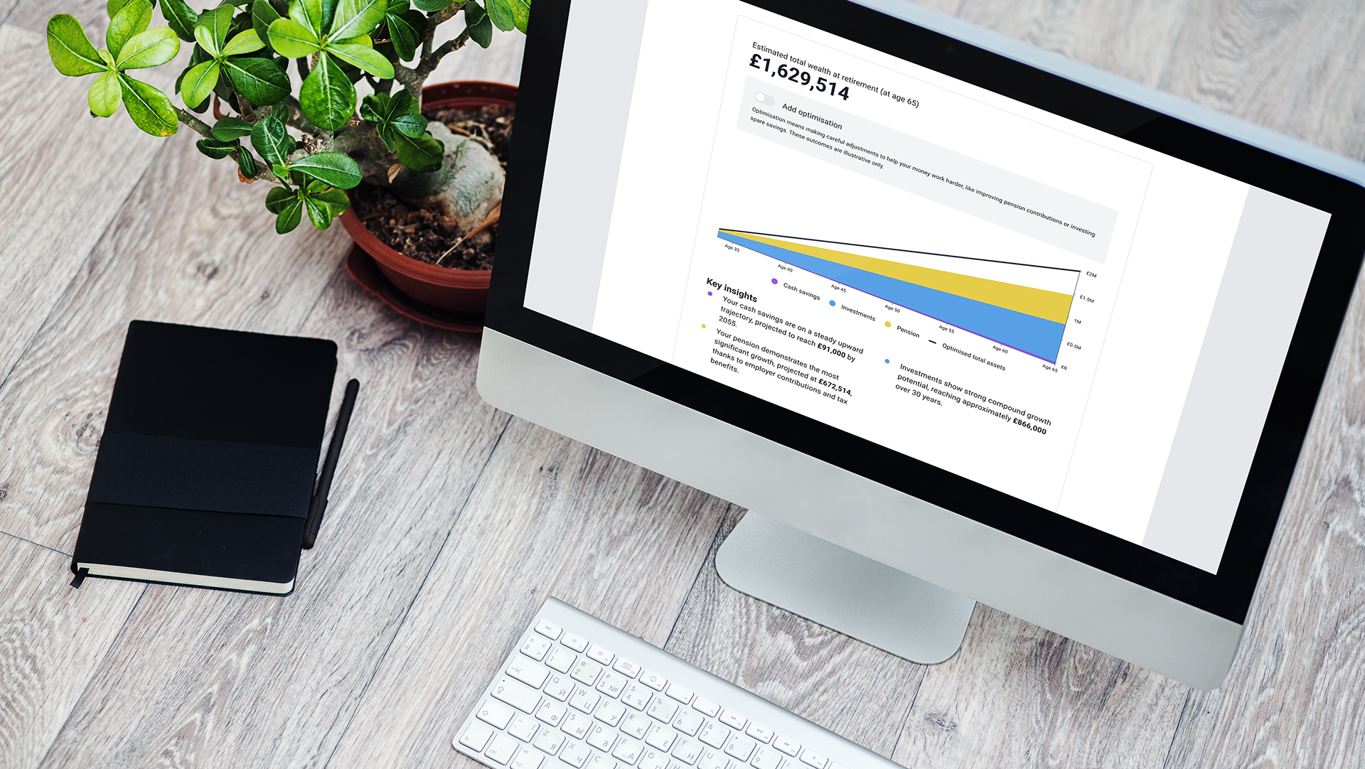 Estimated financial snapshot section of the mini plans results page.
The problem
Octopus Money's onboarding collected detailed financial information through a hundred-plus question flow. The payoff was invisible until the first coaching call, often weeks later. Users invested significant effort without seeing anything in return.
For B2B SaaS tenants accessing the experience through Propeller, this compounded. They needed customers to feel excited early.
The brief had two layers: embed a compelling Mini Plan within onboarding that demonstrated value upfront, and make it configurable across multiple brand surfaces without compromising the coaching experience that followed.
My approach
I started with medium fidelity prototyping to pressure test whether we were framing the product correctly. Working with a freelance user researcher, we ran moderated sessions with non-customers exploring expectations of coaching, reactions to financial data in isolation, and the importance of the human element. Research showed that data visualisation created powerful moments of recognition, but only when users had provided enough input for the output to feel credible.
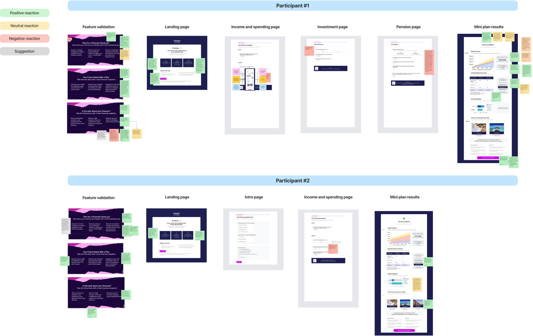 The medium-fidelity prototype was built to drive user interviews. It enabled us to uncover unexpected users needs that shaped the direction of the solution.
I organised the findings into two personas: the overwhelmed procrastinator and the anxious planner. The overwhelmed procrastinator needed reassurance and a clear path forward, so I stripped the questionnaire down and framed outputs encouragingly. The anxious planner needed transparency and context, so I invested in detailed data visualisation and supporting copy explaining what the numbers meant in practical terms.
The medium-fidelity prototype was built to drive user interviews. It enabled us to uncover unexpected users needs that shaped the direction of the solution.
I organised the findings into two personas: the overwhelmed procrastinator and the anxious planner. The overwhelmed procrastinator needed reassurance and a clear path forward, so I stripped the questionnaire down and framed outputs encouragingly. The anxious planner needed transparency and context, so I invested in detailed data visualisation and supporting copy explaining what the numbers meant in practical terms.
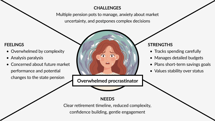 The two personas helped guide design decisions at key moments in the flow.
We tested a prototype with three distinct entry points to learn whether the flow could flex across user types without fracturing the experience:
• An Octopus Money employer customer entering through their workplace.
• An investment prospect arriving via a matchmaker email.
• And a white label customer entering through a SaaS partner's own website.
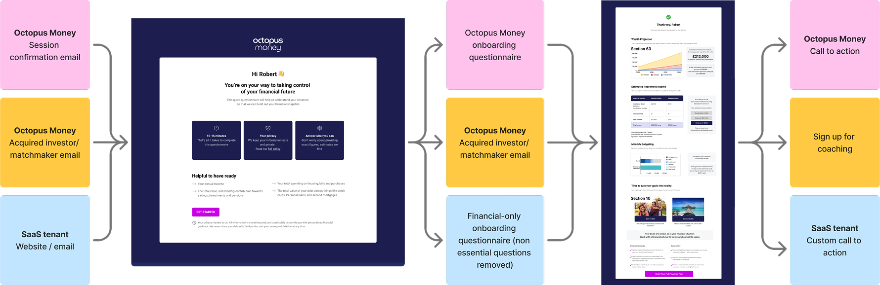 Early testing helped us validate the flow across different entry-points and conclusions.
I then facilitated a stakeholder workshop where each person designed their own version of the output page, presented their reasoning, and we synthesised a final structure together. This surfaced competing priorities early and created conditions for informed decision making.
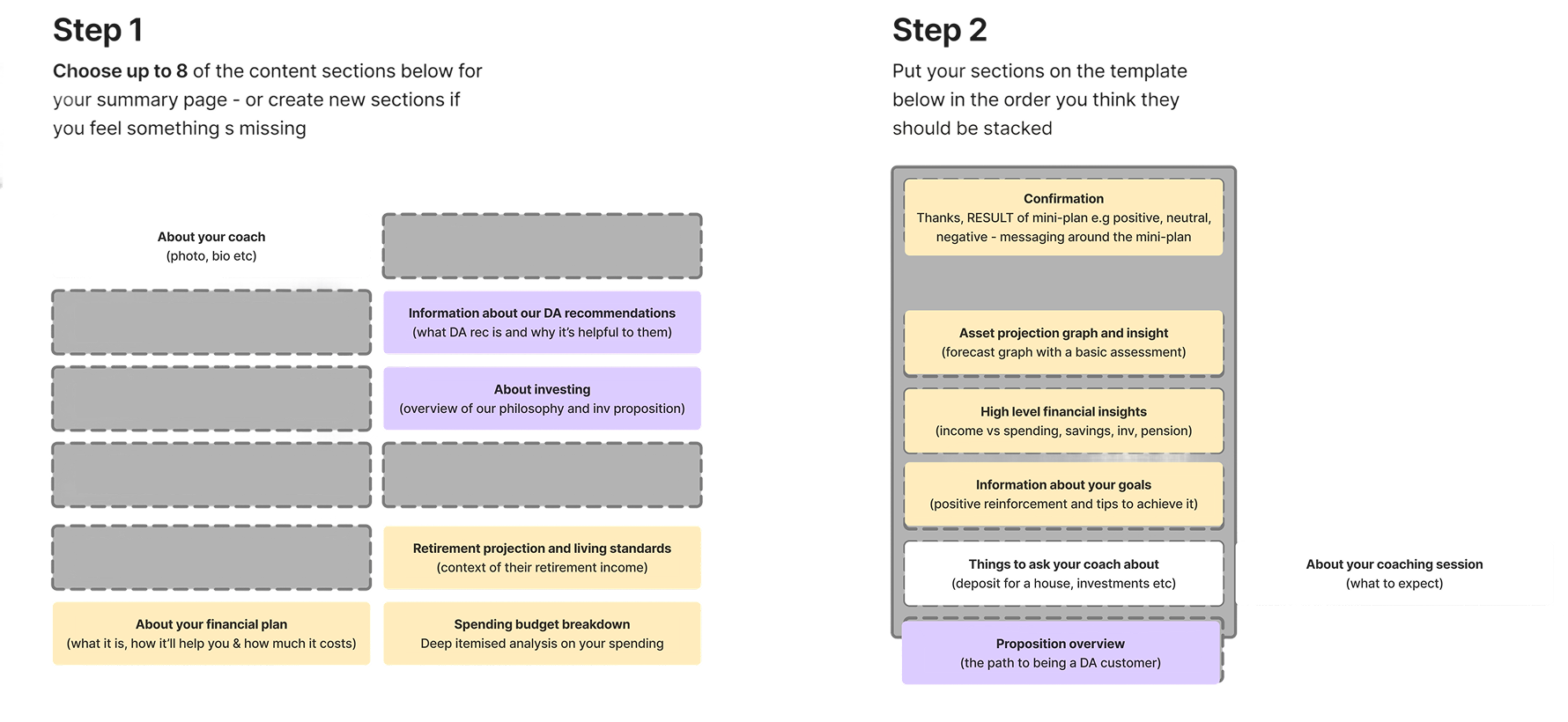 One of the work areas used for stakeholders to build their ideal mini plan page.
The solution
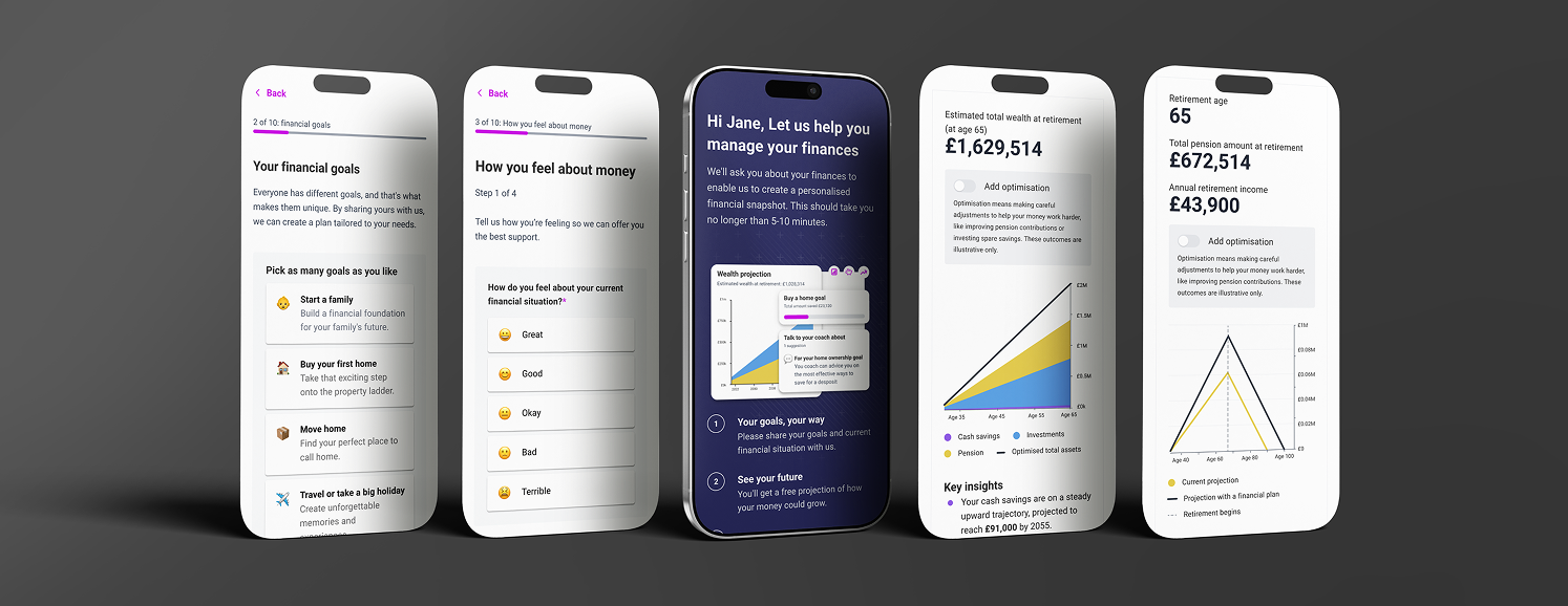
The redesigned flow asked significantly fewer questions while delivering a clear financial snapshot immediately after completion. The retirement forecast contextualised figures against real living standards, showing users how many holidays they might take per year or how often they could afford to eat out.
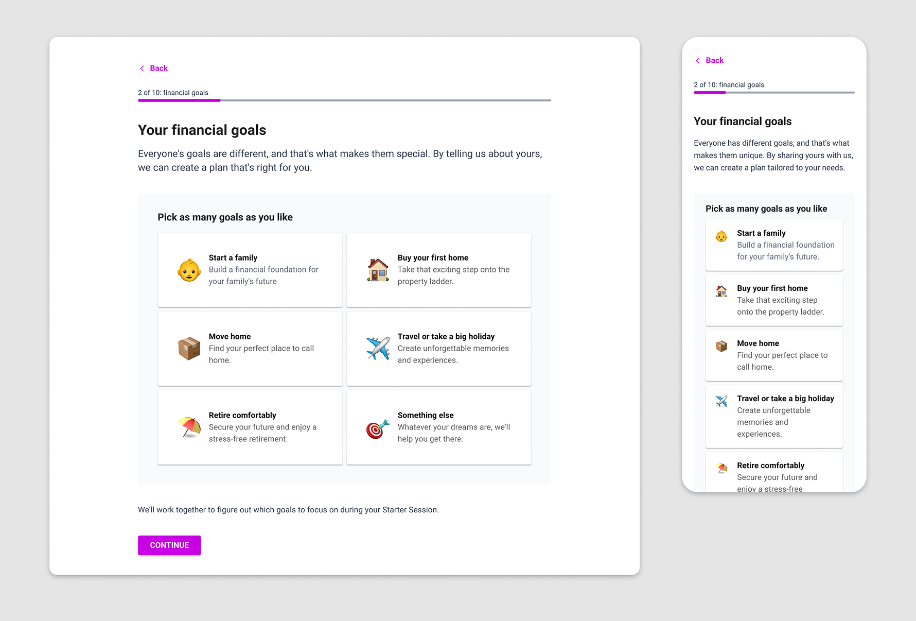
The landing page primed users by framing the experience as personalised and previewing the visual style ahead. Question pages were optimised for mobile using emojis to inject warmth into a minimal aesthetic, generic enough for white label use. The Mini Plan used inclusive copy throughout, framing less positive results as opportunities rather than failings. Calls to action were fully configurable, adapting depending on whether the journey led to coaching or another outcome entirely.
My reflection
This project sharpened my thinking on designing for two distinct audiences at once. Working as an equal partner with a researcher, rather than treating research as a handoff, meant findings were more actionable and design decisions easier to defend.
The coaching team's concerns also turned out to be a useful creative constraint. Sometimes the most valuable input comes from the people who are most worried about what you're building.